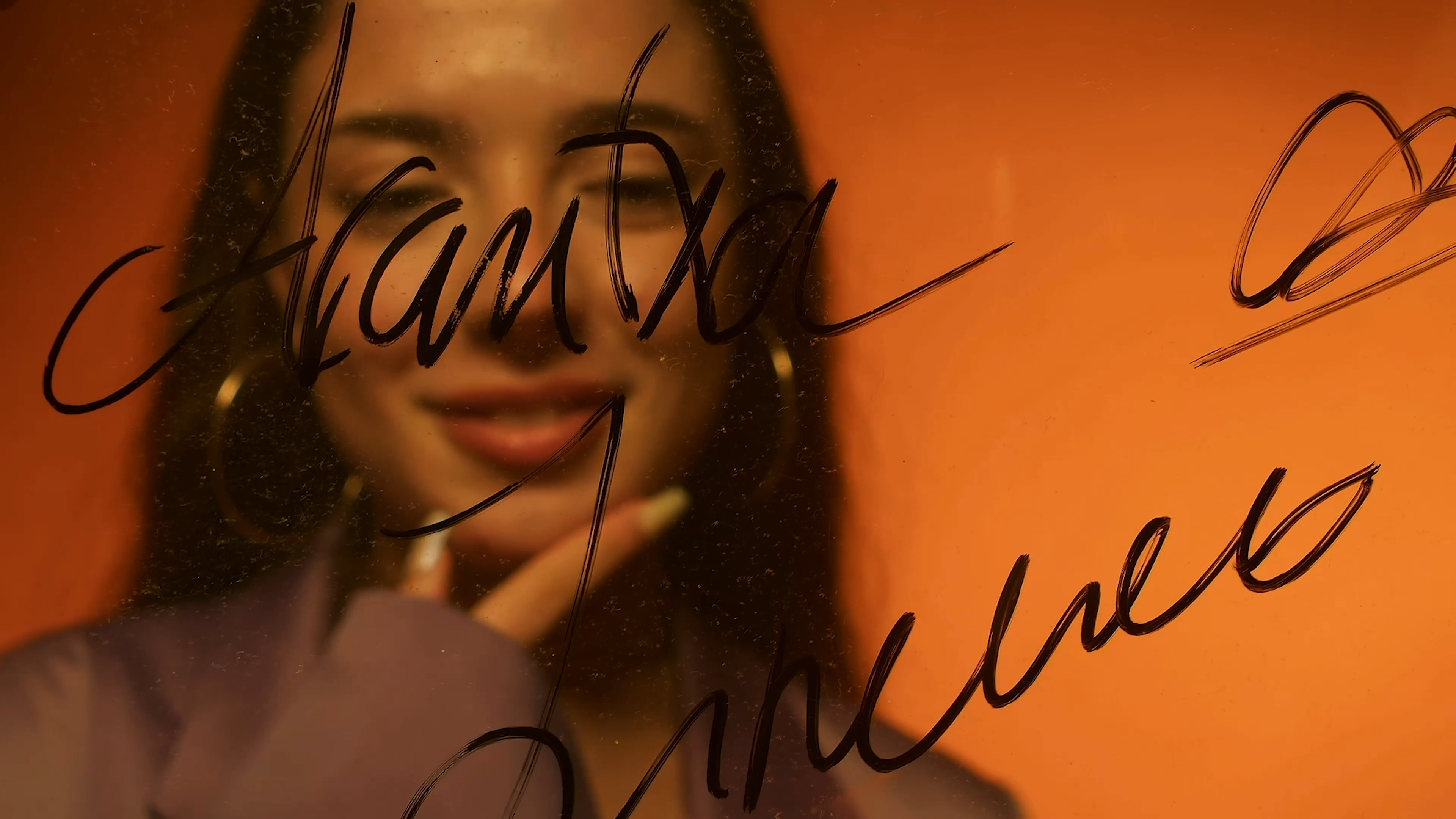
Mente
Ruidosa
Three poetry books that turn anxiety, longing, and memory into a designed object.
Mente Ruidosa ("Noisy Mind") is my Bachelor's thesis for Design & Creative Technologies at UPV Valencia, subtitled the creation of three poetry books as a work of emotional self-reflection. It began with my own experience of anxiety during adolescence, when writing became a way to turn mental chaos into order. The poems came first; the project gave them a body.
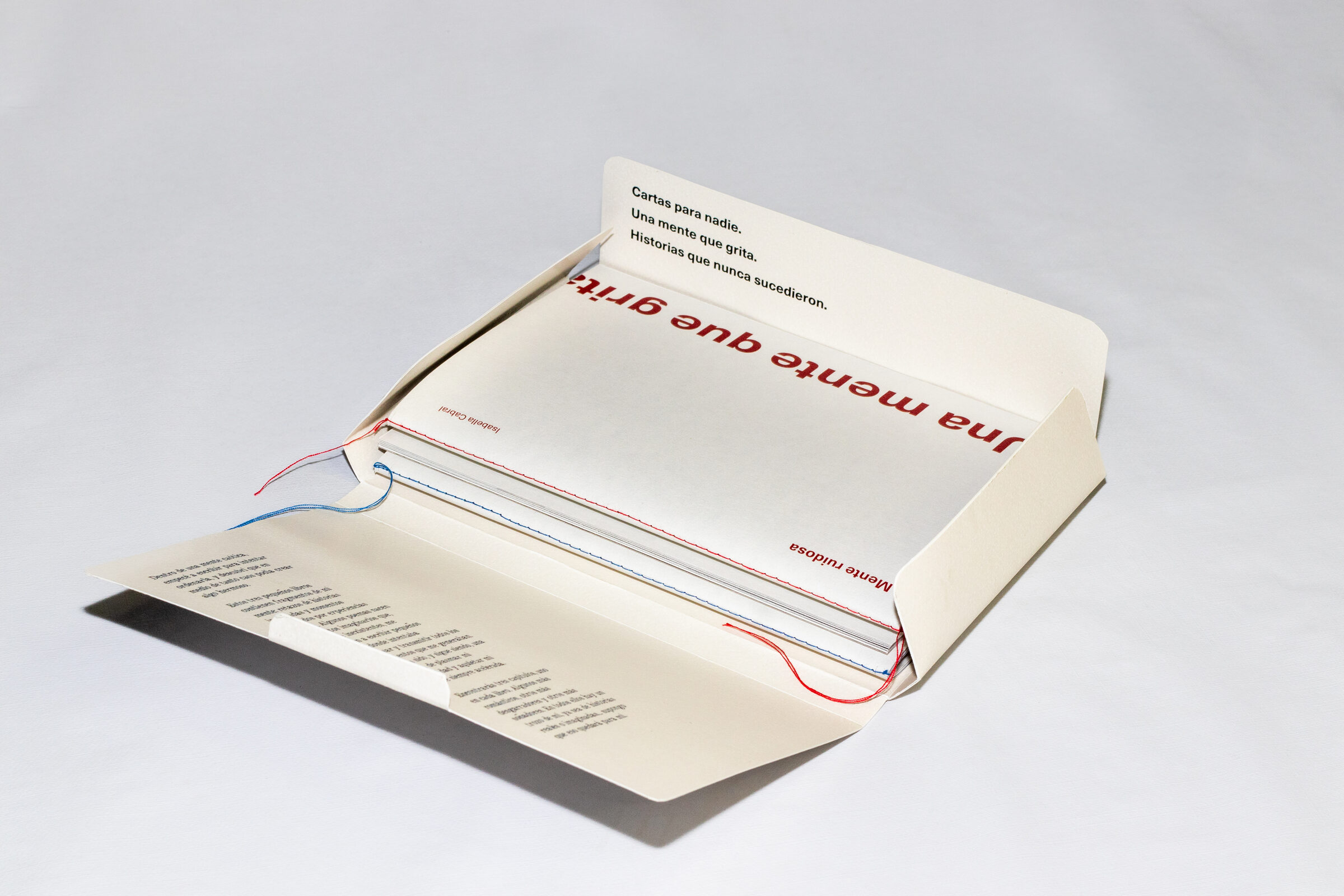
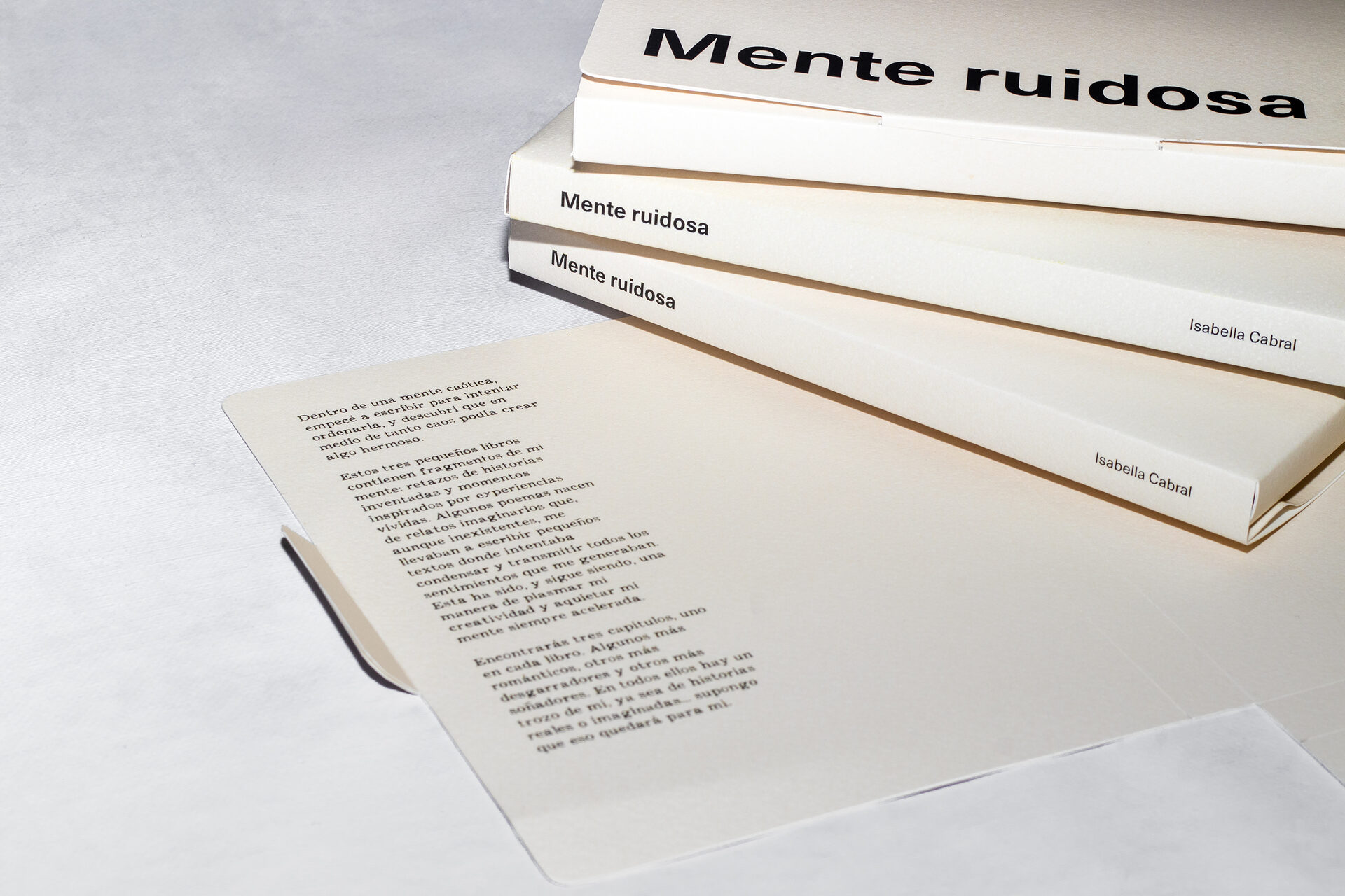
The work combines typography, photography, and illustration to explore one central question — how word and image can work together to express what neither can say alone. The result is three hand-bound books, each holding a different emotion, gathered inside a custom slipcase: Cartas para nadie (blue), Una mente que grita (red), and Historias que nunca sucedieron (sepia).
Flip-through — Cartas para nadie · Una mente que grita · Historias que nunca sucedieron
Externalising emotion as a design problem.
The conceptual starting point is simple but serious: holding emotions in is bad for us, and externalising them — through writing, photography, art — is a recognised tool for processing them and building emotional intelligence. Graphic resources can carry what words cannot. Mente Ruidosa puts that idea to work, treating the page as a space where text and image enrich each other rather than repeat each other.
"I didn't want a conventional editorial project. I wanted word and image to depend on each other — to leave gaps the reader completes themselves."
A key principle throughout is the ellipsis: leaving things unsaid. Details are omitted so the reader fills the connections implicitly, building their own emotional reading instead of receiving a closed one.
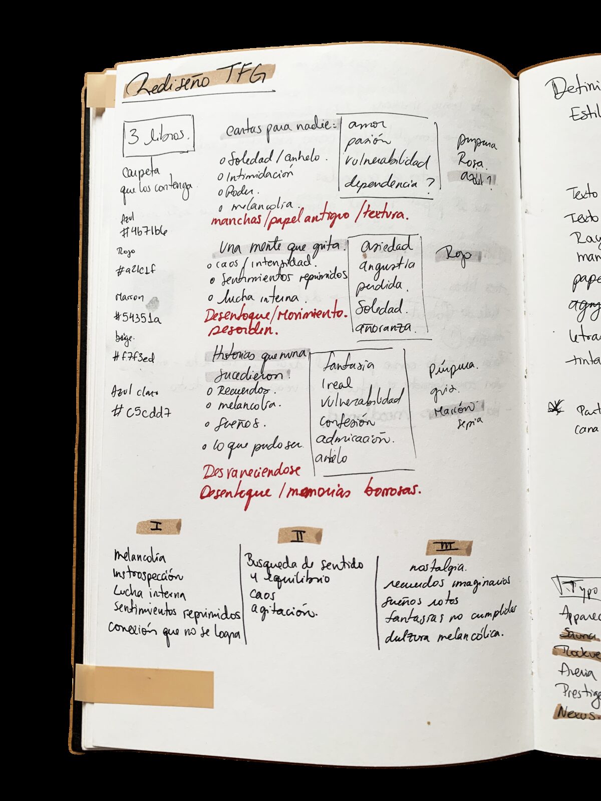
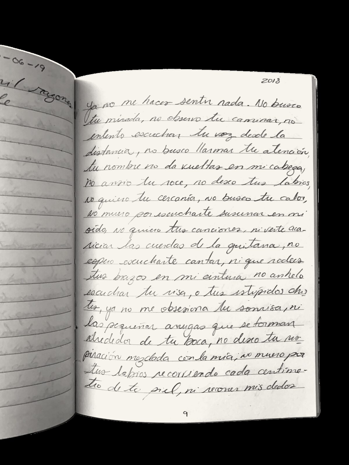
Early planning — mapping each book to an emotion and a colour · the original handwritten poems
Studying how word and image have lived together.
The project is grounded in a study of the relationship between poetry and photography — from early pioneers to the idea of the photopoem, where poem and photograph hold equal weight and are tightly bound, and calligrams, where typography is arranged into figures related to the poem's meaning. Analysing existing works set the rules for my own: how to lay out text according to its length, how to keep word and image independent yet mutually reinforcing, how a reduced palette and the shape of a photograph can structure a page.
Works analysed include La septième face du dé (1936), O mergulhador (1968), Paradis Sans Espoir (1998), and Et Eu Tu (2003) by Arnaldo Antunes & Marcia Xavier. Full references below.
One system, three emotional registers.
Early drafts kept all the chapters in a single book, but the design never cohered — so I split them into three, each holding one emotion, then unified them inside a slipcase titled Mente Ruidosa. A near-A5 format (19×13 cm) keeps the books easy to handle and the compositions from feeling too vertical. A flexible grid with many divisions allows every page to be unique while staying coherent.
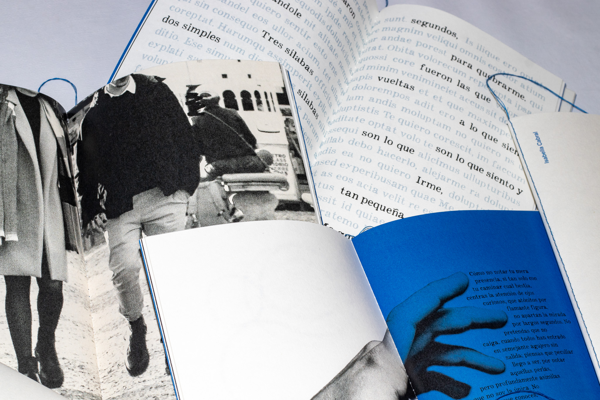
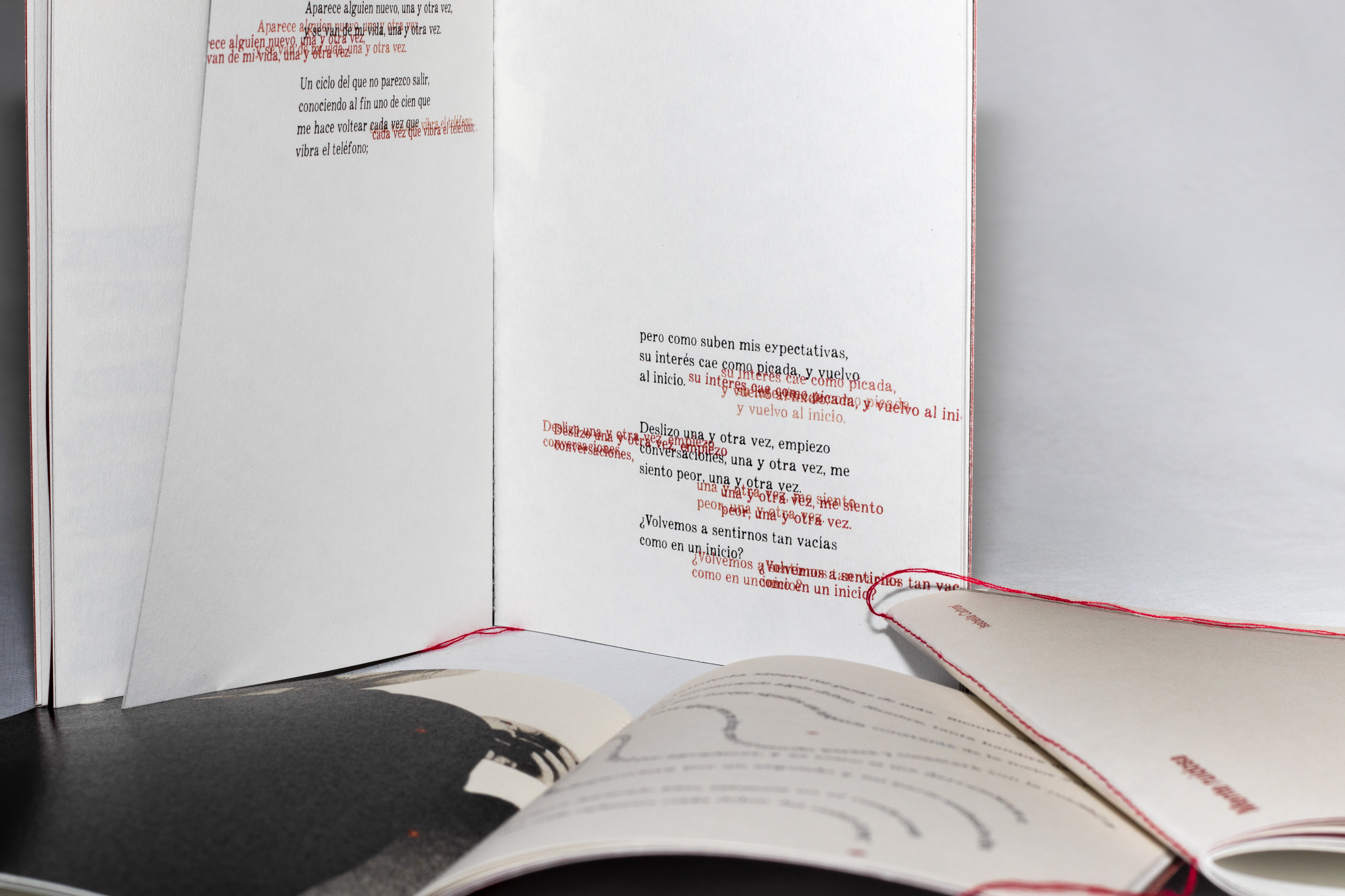
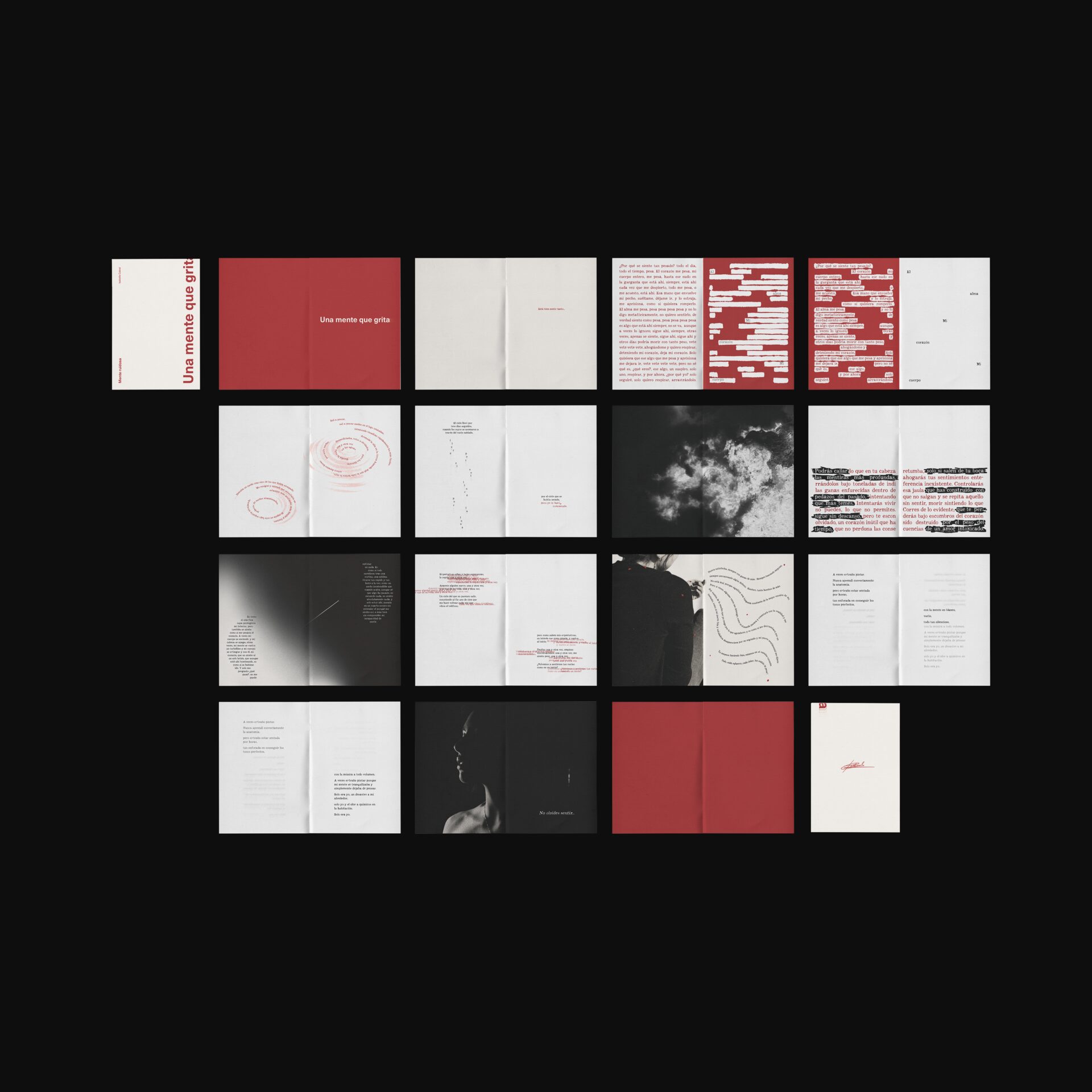
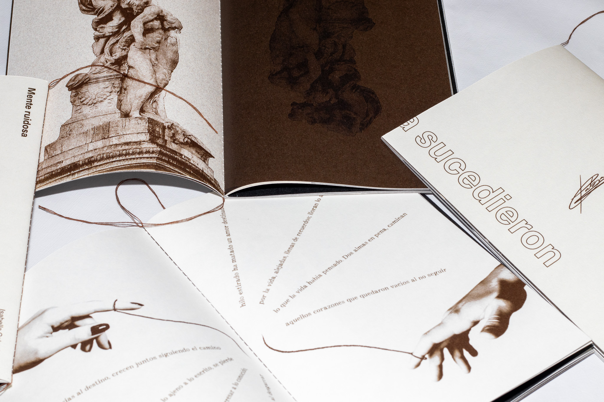
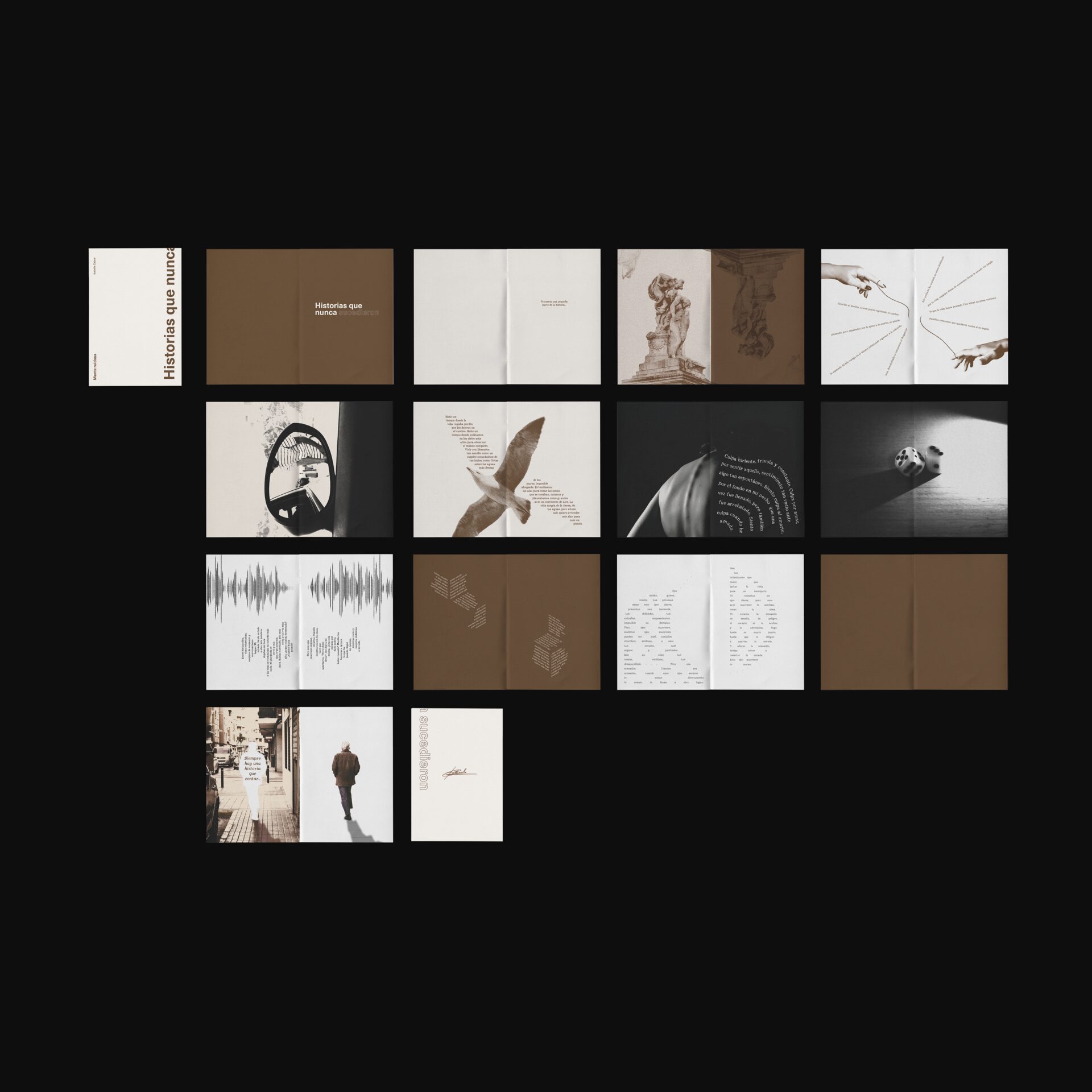
The covers are deliberately minimal — cream stock, Neue Haas Unica in bold, a single distinctive detail hinting at the book's interior, and the author's signature on the back. Inside, the contrast begins: the typewriter typeface Appareo, used across all its ink-pressure weights, gives the interiors a personal, emotional texture. Each book opens with an introductory line on cream in the chapter's colour, and closes with a final line set over an image.
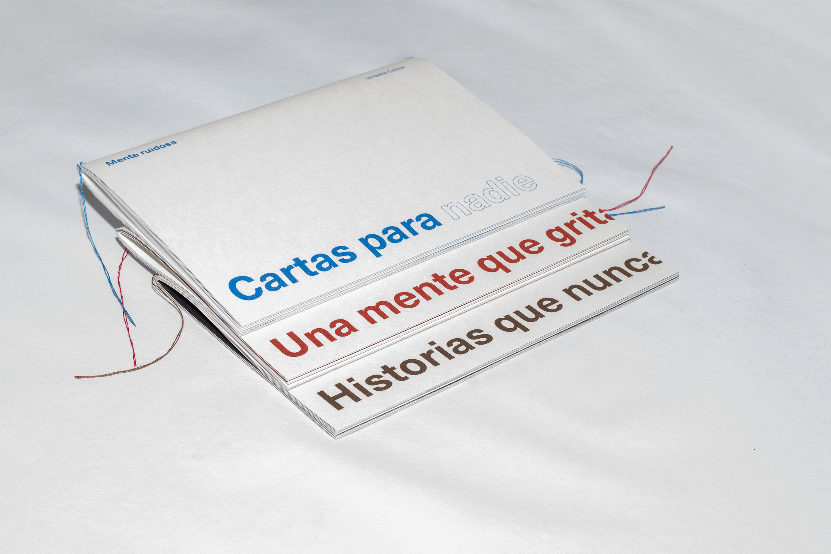
The three covers — a unified minimal system in blue, red, and sepia
Pauses built into the reading.
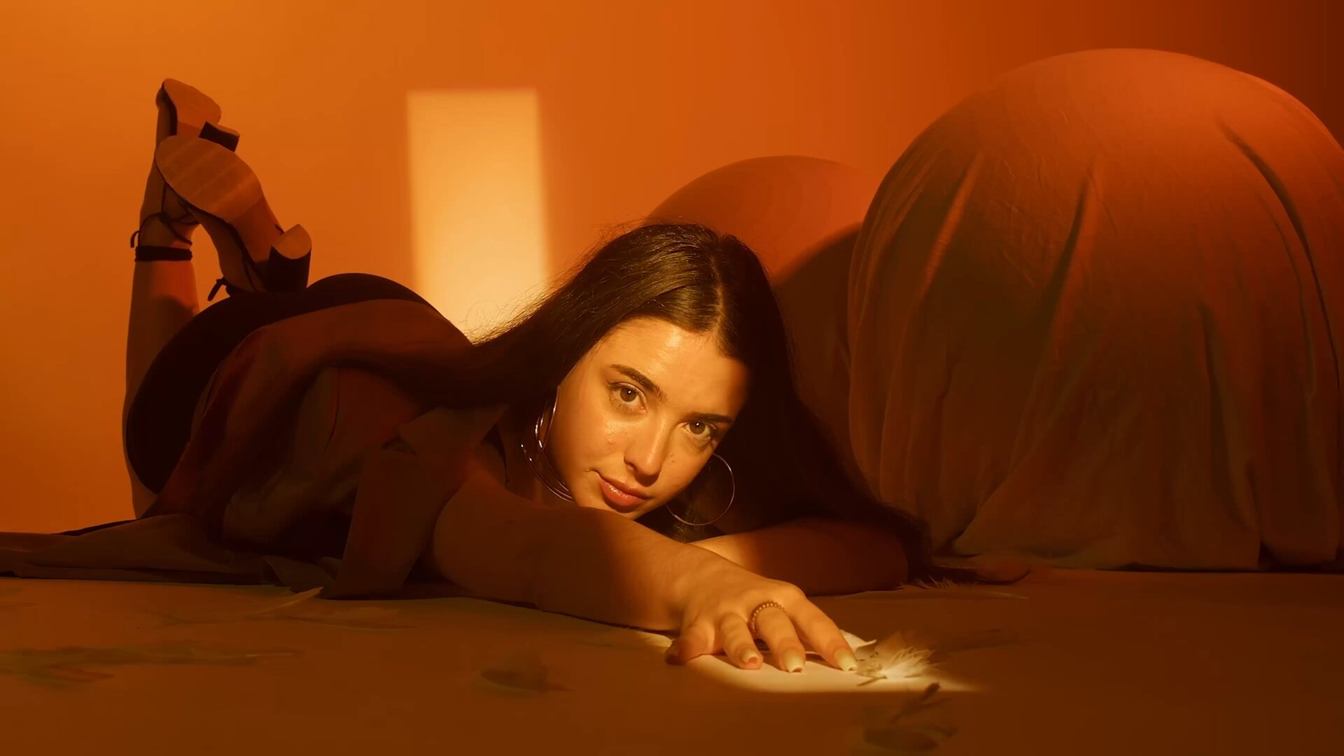
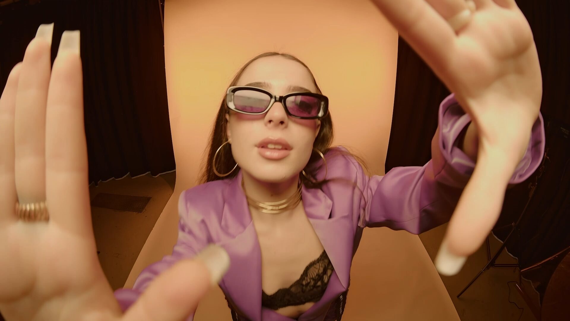
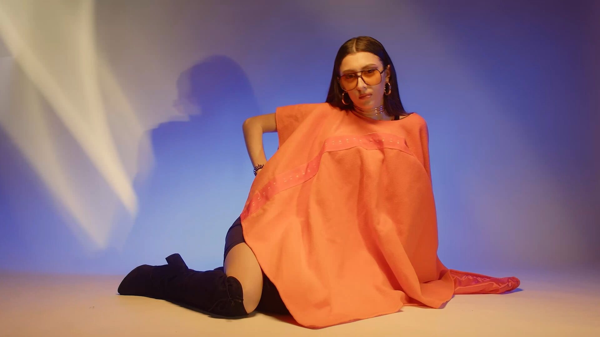
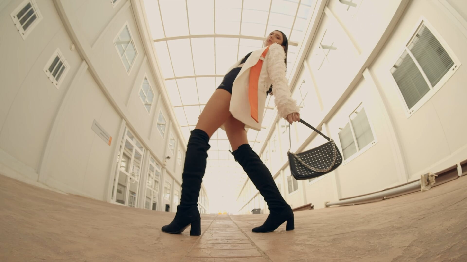
"Rest pages" with full photography were added to balance the design and give the eye somewhere to pause between poems. Every photograph in the three books is spontaneous — taken in real moments: outings, everyday scenes, street shots, and self-portraits. Worked in Photoshop toward beige-and-black tones, they take on an analogue quality, high in contrast and grain.
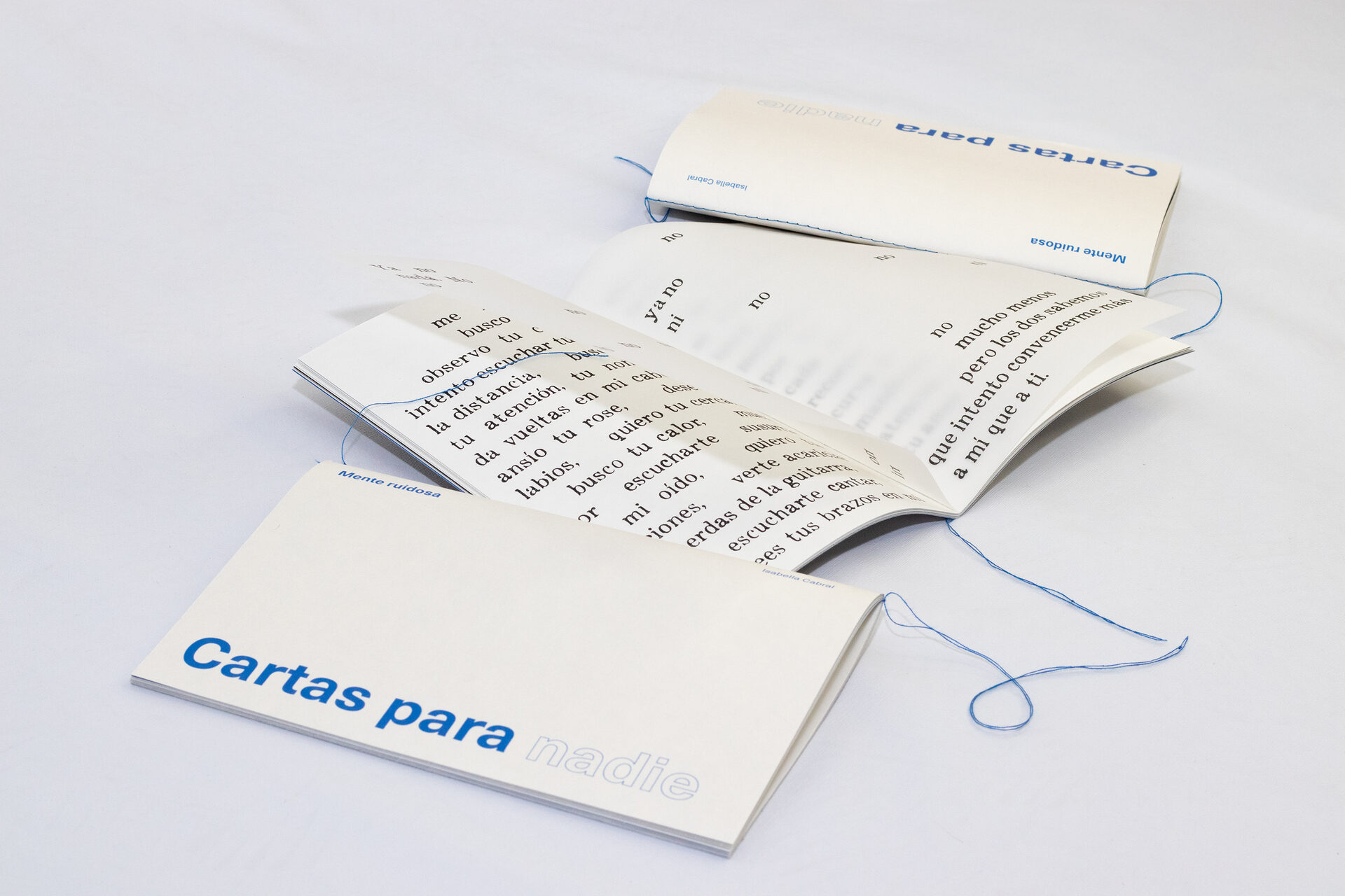
Cartas para nadie
The most melancholic and romantic book — letters written to someone who doesn't exist. Inspired by the romance novels I used to read, it works in black, white and warm beige, with pastel blue for nostalgia and a deeper blue for contrast. Its photographs are mostly close-up details of the body, blurred so identity stays unreadable — fragments of memory the viewer completes.
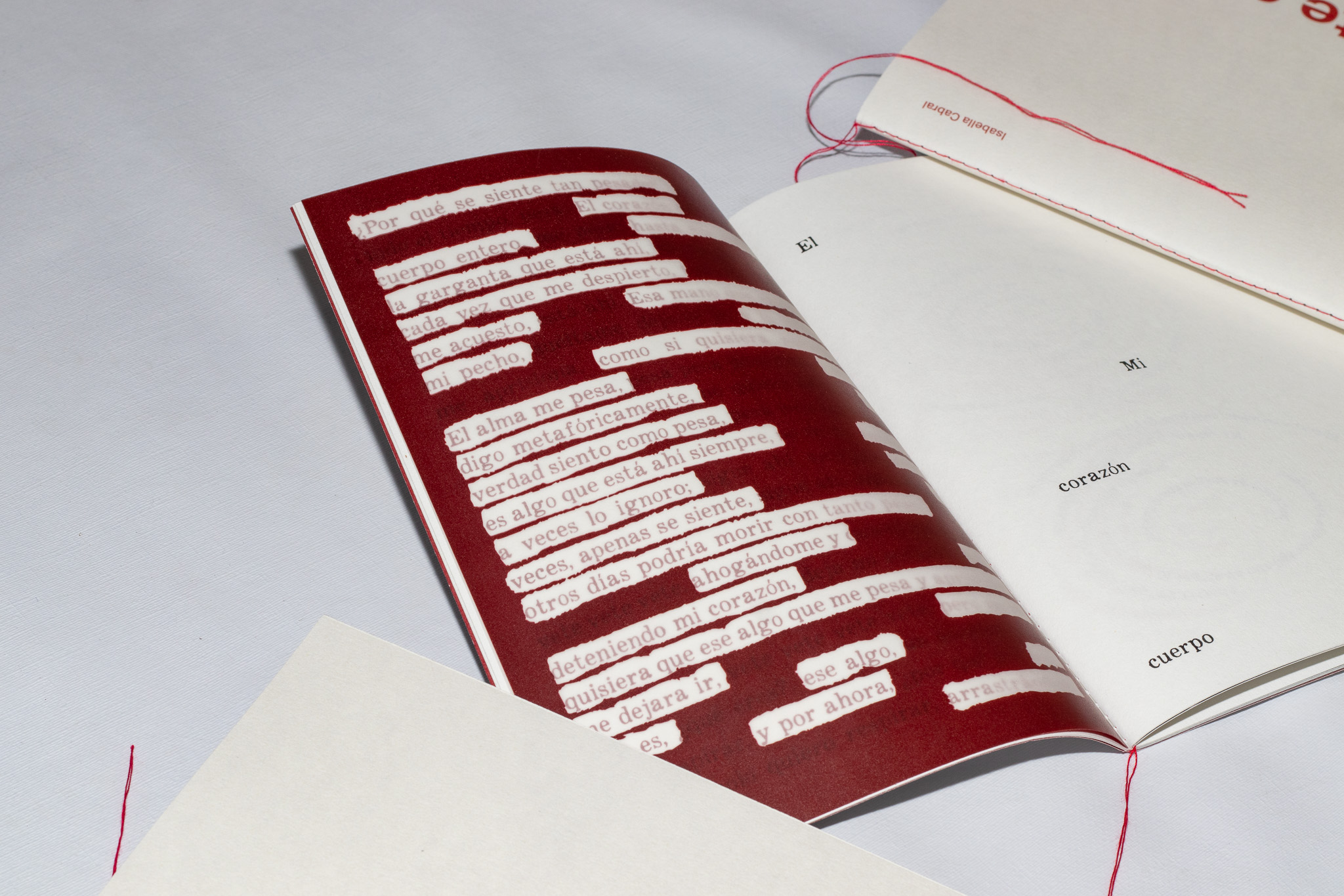
Una mente que grita
The most personal book, centred on anxiety — a conversation, an argument, with myself. A dark red carries unrest and anger. Abstract illustration and low-key portraits dominate, high contrast picking out only key areas to mirror the chapter's emotional darkness.
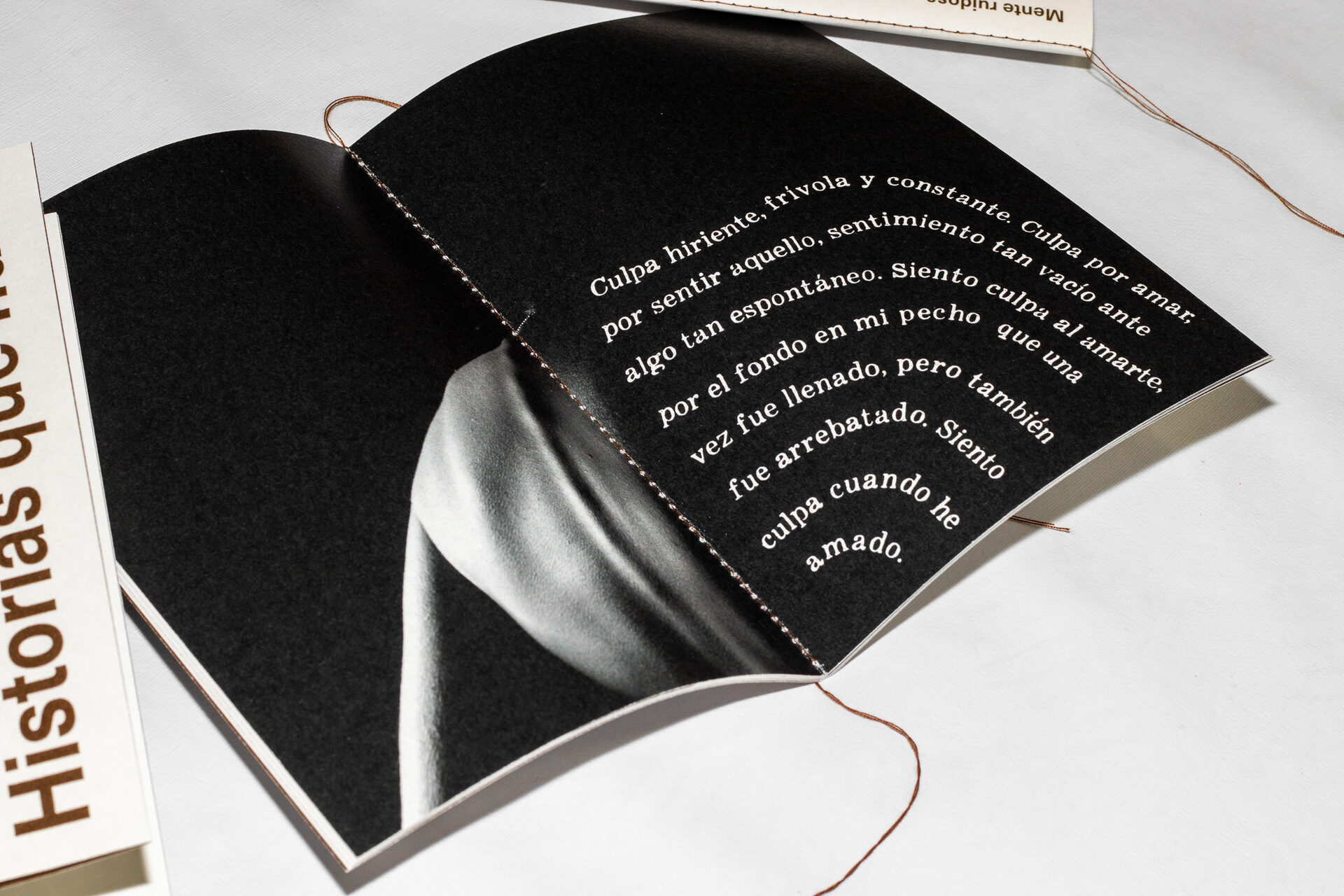
Historias que nunca sucedieron
The most narrative book — unreal stories, born from my love of writing other realities where the mind wanders and forgets everything else. A warm brown reinforces memory and the feeling of something old. Its imagery is more literal, moving between bodies, places and actions, with illustration completing the photographs.
Sustainable papers, hand-stitched binding.
The books are printed on Materica Gesso 120g — a textured, sustainable stock that lifts both typography and image — with tracing-paper pages added for interaction. The slipcase uses Tintoretto 220g, textured and slightly glossy, suited to packaging. Both papers are FSC-certified. Binding is Singer-sewn, reinforcing the handmade character, allowing coloured threads and a flat 180° opening. The slipcase echoes the covers in black, with a spine and an introduction explaining the collection and naming the three books inside.
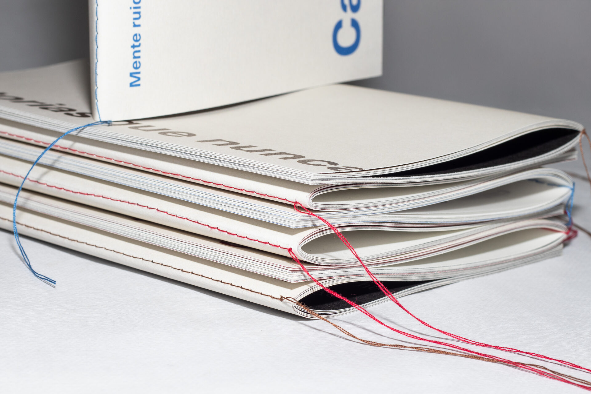
Left: visible coloured Singer stitching · Right: the custom unfolding slipcase
A complete, hand-produced object — and a way of working.
Across a long process of structuring calligrams and tuning the relationship between word and image, the three books came together as one coherent collection: a minimal exterior holding an experimental interior, a reduced palette and a single typeface building an atmosphere aligned with the poems. The project is also aligned with the UN Sustainable Development Goals — emotional wellbeing through art (3), self-knowledge through experimental design (4), and responsible, low-impact materials (12).
Beyond the thesis, Mente Ruidosa shows an ability to carry one concept-driven idea across hundreds of pages, three formats, and a full physical production process — from typography and original photography to binding and finishing — without losing its emotional core. There are plans to produce further copies for wider distribution.
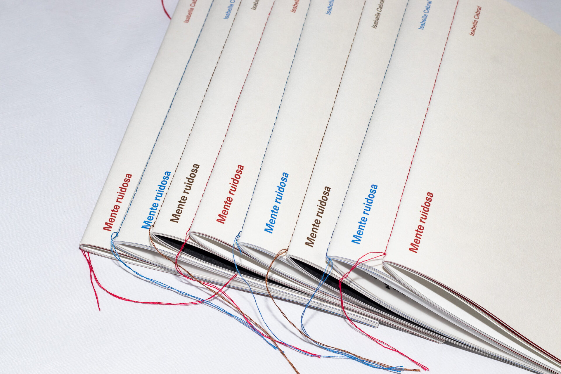
Mente Ruidosa — the complete edition, with its signature coloured stitching
Hugnet, G. — La septième face du dé (1936) · Tagle, P. — O mergulhador (1968) · Paradis Sans Espoir (1998) · Antunes, A. & Xavier, M. — Et Eu Tu (2003)
Artistic references: Walker Evans · Duane Michals · Saul Leiter · Chris Ashworth · Piper Ferrari · Yana Plackonic
Reference works are cited for context and remain the property of their respective authors. All design, photography, illustration, and production shown is original work by Isabella Cabral.